Vocab App
mobile app
UX design process of a vocabulary learning application
Let me take you on an adventure
As this project was my very first UX Design challenge, I decided to have a bit of fun with it and approached this task as if I was embarking on a journey through the unknown.

Overview
VocabApp is a native mobile application which empowers people to learn new vocabulary in an easy and effortless way. The purpose behind creating this project was to learn the most important terms, tools and techniques of user experience design.
This project was created during CareerFoundry UX Fundamentals course – from mid September to the beginning of October 2019.
My Role
Competitive analysis, user research and analysis, information architecture, wireframing and prototyping, usability testing
Testing the Waters
Competitive Analysis
As many journeys start with researching the field, my adventure wasn’t any different and started with researching as well.
I conducted a competitive analysis of a few existing mobile vocabulary apps in order to understand the problems I would be tackling in the next stages of the design process. I compared how different flashcard apps work, if they are useful and easy to use, and what kind of features do they have.
Gathering all that information helped me think of an answer to a question: What could I do differently?

Memrise

Drops

Babbel
Memrise
Positives:
- Various types of exercises
- Learning words in context makes it easy to memorize new vocabulary
- Possibility to download particular courses and use them offline
- Short videos with native speakers
- Users can choose from seven difficulty levels
- Marking words as Difficult makes them come up more often in reviewing sessions
- Basic version of this app is enoug, no need to buy a premium version
Negatives:
- Pop ups advertising Premium version of the app emerge all the time, which is distrupting user experience
- It is very easy to mark random words as Difficult by mistake. If the user wants to change it, they need to search for this particular word manually.
Drops
Positives:
- Easy set up, no need to register
- Beautiful graphics, pleasant animations and sounds
- Short introductory tutorial
- Lessons last only five minutes, the app provides an effortless way to learn new vocabulary
- Variety of excercises
- Ranks and weekly rewards that keep the user interested
- Possibility to choose a learning path: basic, interacting with locals, tourism, romantic interest, etc.
Negatives:
- Basic version lets you use the app for only five minutes, every ten hours
- Great for beginners, useless for intermediate or advanced learners
- No clear difference between the end of the tutorial and the beginning of first session, making it easy to waste first free minutes on learning easiest words
- No possibility to choose language level before the tutorial
Babbel
Positives:
- Conversation-based learning
- Mix of learning styles and excercises
- Numerous languages to choose from
- Possibility to practice speaking
- Pop ups with grammar explanations
- Learning in context
Negatives:
- The user has to go through a lengthy registration process only to find out that the basic version of the app offers access only to the first lesson
- Only Premium account gives access to the content of the app
- Plain and boring user interface
Conclusions
I believe that from the three chosen examples Memrise is the most universal app, as it meets the needs of most users. Even the basic version of the app is suitable for learners on all levels, since there is a possibility to choose from seven difficulty levels. Excercises are balanced and the app can be used offline.
Aestetically pleasing graphics, animations and sounds of Drops create a very positive experience. The app is very intuitive and focuses on visual learning. However, the basic version is very limited and the app is mostly targeted to learning basics, making it a useless tool for more advanced learners.
My experience with Babbel was disappointing. Even though the app has good reviews and claims to offer language learning in an effective way, going through a long registration process only to find out that the basic version of the app offers only one lesson made me delete the app very quickly. A single and most basic lesson is not enough to encourage users to pay for the app.
Setting off on a Journey
User Research
To make sure that my design would meet the needs of my users, I conducted user inerviews in which I asked different people about their experience with vocabulary building apps. I wanted to know if they enjoy using these kinds of apps, what would be the best way to learn new vocabulary, or what is the most challenging thing while learning a new language.
But mainly I focused on these three things: what kind of methods of learning they find useful, what keeps them motivated to stay on track, and what are the major difficulties and frustrations associated with language learning process.
Daniel
Age: 35
Senior 3D Artist
Klaudia
Age: 22
Flight Attendant
Adam
Age: 28
PhD Student
Daniel
Bio: Daniel is a native German speaker. He works as Senior 3D Artist in an international company, in which English is the official language. He would like to improve his French but he says that without a clear set goal it is hard to stay motivated.

Klaudia
Bio: Klaudia is a native Polish speaker. She is a Flight Attendant and says that anyone considering a career in aviation has to speak English, as it is the official language of the industry. She loves to travel, seeing new places and meeting new people from all over the world. She is open minded and curious.

Adam
Bio: Adam is working on his PhD in Psychology and gives lectures at a University. He is a native Polish speaker who has fallen in love with Cuba long ago. He is trying to learn Spanish as one of his life-long plans is to travel to Cuba and make a trip around the island.

Gathering the Crew
User Persona
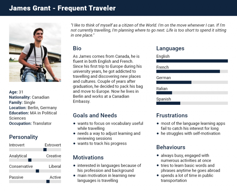
Equipped with data gathered during my user interviews, I went on to create a user persona, representing possible goals and pain points of my potential users.
Meet James – Frequent Traveler
In order to empathise further with my end-users, I I tried to design my app, bearing in mind the needs of people like James. I went on to create different User Stories and Job Stories which would allow me to see certain solutions from my persona’s perspective:
User Stories
As a frequent traveller, I want…
…to learn new vocabulary in an easy and effortless way, so that I can be ready for my next trip.
…to have access to a wide range of useful vocabulary, specifically designed for different difficulty levels, or concrete purpose of learning, so that I will not have to waste my time on learning words I don’t need or already know.
As an active and busy person, I want…
…quick learning sessions, so that I wouldn’t have to devote a lot of time a day to learn.
…to be motivated and reminded of new learning sessions, so that I won’t forget to do it regularly.
Job Stories
When…
…I’m abroad, I want to have sufficient knowledge of basic and the most useful vocabulary, so I can communicate with the locals when I need it.
…I’m having a busy and exhausting day, I want a fun and easy to use app, so I can learn a language in a pleasurable way.
…I’m using a vocabulary building app, I want it to be fun and entertaining, so I can stay motivated to use it.
Problem Statement
James needs a way to learn a wide range of traveled-focused vocabulary quickly and efficiently in a fun and effortless way, because basic knowledge of a language of his choice would significantly help him with his travels.
Planning the Route
User Flows and Task Analysis
As the next stage in my journey, I had to identify which tasks users will need to complete when they use my product, and then break them down into granular steps. I devised two different user flows: the first one shows the process of either creating a new account or signing in to an existing account after installing the app on a new device. The other shows a path to create a new learning card. Those user flows include specific choices my users have in order to complete certain tasks.
Task One: First Setup
Entry Point: Open App
Success Criteria: Setup Completed
1. User opens the app for the first time after installation
2. Three onboarding screens. The third screen has a button: “Let’s get started!”
3. Login/Sign Up screen pops up:
- If they don’t have an account, they click: Choose a language
- If they have an account: Sign in
4. The user selects their native language and target languages
5. After selecting their target language, two options pop up: “New to [target language]?”
- If yes, they go directly to register
- If no, they take a short test determining their difficulty level
6. After selecting languages, they register either with Facebook, Google or e-mail
- If they e-mail, they need to type in their address and password
7. Tutorial pops up:
- Yes, follow the tutorial
- No, go to Main Menu
8. After the tutorial the user is transferred to Main Menu: Setup Completed

Task Two: Create a New Flashcard
Entry Point: Open App
Success Criteria: Flashcard Created
1. User opens the app and arrives directly at Main Menu
2. To make a new card, they click on Create a New Flashcard button
3. An option Select Category pops up:
- they choose category and proceed to Type Word
- If there is no relevant category, they click on Add Category button
4. The user types in a word of their choice
5. Is the word already on the list?
- If not, the user proceeds to typing definition
- If yes, information pops up: “Word already exists. Choose another one?” – If yes, go back to Type Word. If no, go to Main Menu
6. The user types in a corresponding definition
7. A window pops up: “Save? Yes/No”
- the No option takes them back to Type Word stage
8. After saving the flashcard another window pops up: “Success! Flashcard saved”
9. The user has another option: “Would you like to make another flashcard? Yes/No”
- If yes, they are transferred back to Type Word stage
- If not, the No option takes them to main menu

Destination: Prototype
Sketching
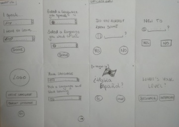
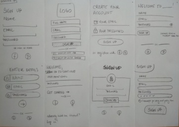
After long and complicated preparations, there was finally time to start the part of the journay I was the most excited about: sketching. I started with a lot of quick, basic sketches, which helped me then move on to more advanced things. In this stage I used common UX method – Crazy Eights.
Wireframing and Prototyping
After a huge amount of wasted paper, I finally arrived at complete wireframes. Then I was finally ready to make my first low fidelity prototype. To kick things off, I used the previously mentioned user flows to create the prototype.
Task One: First Setup
Task Two: Create a New Flashcard

Clickable Prototype
With the use of Marvel App, I created my very first clickable prototype. To see it, click here
Asking for Directions
Usability Testing
When I was finally ready with my first low fidelity prototype, I proceeded to usability testing, in order to receive real user feedback on my app and to validate the design decisions that I made.
Scope
VocabApp usability test will focus on testing app’s basic navigation and features
Schedule
Tuesday 24th and Wednesday 25th
Sessions
10 minute sessions, 3 participants: two online, one in person
Equipment
Participants will use their mobile phones. Remote tests will be conducted via Skype.
Metrics
0 = No usability problem:
I don’t agree that this is a usability problem at all
1 = Cosmetic problem only:
need not be fixed unless extra time is available on project
2 = Minor usability problem:
fixing this should be given low priority
3 = Major usability problem:
important to fix, so should be given high priority
4 = Usability catastrophe:
imperative to fix this before product can be released
Scenario Tasks
- You’ve just downloaded VocabApp from App Store for the first time and you would like to start learning a new language. To do that, you need to create a new account.
- You’ve already used VocabApp before, but you just downloaded it on a new device. Try to log into an existing account.
- You’ve just gone through some learning sessions and you noticed that some words which you would like to learn are missing. Try to create a new card.
- The word that you would like to include in your learning sessions does not fit in any existing category. Try to add a new category.
Test Results

My testers spotted couple of usability issues and provided me with a lot of useful feedback. Among other things, it turned out that I forgot to add an exit button which would let my users exit the signing up process, if they started it accidentally. They also pointed out that the way I placed buttons on the main screen is a bit confusing.
However, most importantly, they spotted that I forgot to add an option into the main screen, which would allow my users to change their target language, as it is possible that some users would want to learn more than one language at a time.
I felt like I have failed James, my user persona! This kind of feature would be ideal for his needs, as he tends to do couple of things at the same time. Why wouldn’t he want to learn more than one language at once? I guess James would have deleted my app right after installation…
Taking a Step Back
Implementing Changes
One of the major changes that I introduced to my prototype was the main screen. I added Categories as a fourth button and in a top right corner, I added an option to switch between target languages (third screen). I also added a missing exit button and fixed other, less severe usability problems.
Finish Line?
Is it over?
There is still a lot to be done to turn my app into a complete project. But the main purpose behind creating the project was never reaching a final product – it was to learn the most common practices and techniques of user experience design in practice.
So, even though the filish line is still far away, the plan is to focus on a more detailed project next.
What have I learned?
The most important take away from this experience is that it is essential to listen to your users. It’s very easy to follow your own idea about your product, but you have to bear in mind that you’re not designing for yourself. At all stages of your journey as a designer, you have to bear in mind the needs of actual users.
I also learned a huge importance of usability testing, as one of the tools to keep your focus on the users.

Haven’t seen the VocabApp prototype yet? If you’re interested, click here!


