InkTank App
responsive web app
Solution for tattoo enthusiasts to explore design inspirations and a platform for tattoo artists to connect with new clients
About the Project
Overview
InkTank is a responsive web app that enables tattoo enthusiasts to explore inspirations for tattoo design, as well as provides tattoo artists with a platform through which they can showcase their work and connect with new clients.
This project was created as a part of CareerFoundry UX Design course.
My Role
User research and analysis, information architecture, wireframing and prototyping, usability testing, UI design
Tools Used
Adobe XD, InVision Studio, Adobe Illustrator, Balsamiq, Usability Hub, Optimal Workshop, Google Forms, and good old-fashioned pen and paper
Design Process
Define
Understanding the Problem
In the define phase of my design process I tried to establish who I am designing the app for and what the needs of my potential users would be. The question that I tried to answer is: how can I improve the overall process of searching for the perfect tattoo design or the right tattoo artist, while at the same time minimizing potential dissatisfaction with the choice of getting a tattoo.
My app has two types of target users:
- tattoo enthusiasts – interested in getting their first or next tattoo and looking for inspiration or valid information on particular artists or tattoo parlors
- tattoo artists – either individual artists or tattoo shop owners who want to gain new clients
Problem Statement
Our tattoo enthusiasts need a way to find the design they would be satisfied with and to find the artist whose style matches their needs because they want to lower their chances of regretting their tattoos in the future and make sure they are making the right decision.
Competitive Analysis
In order to understand the market and evaluate strengths and weaknesses of my competitors, I conducted a competitive analysis which included SWOT and UX heuristic analyses.
I identified two key competitors to my app:
- tattoo-related apps, for example Tattoodo
- social media platforms, especially Instagram, Facebook, and Pinterest

Tattoodoo – a digital platform for artists to showcase their portfolios and a hub for tattoo enthusiasts to view art and artists. Their users have access to a great number of design inspirations and they can book their appointments directly via the app, which is a feature that makes them stand out from their competition.
Strengths
- strong position in App Store
- huge social media coverage
- appointment-booking feature
- clean and simple UI
Weaknesses
- home page is overflowing with information
- no filtering of search results available
- navigation is confusing at times
Instagram is an immensely popular social platform which serves as a great way for tattooists to gain popularity and share their work. Nowadays, an Instagram account is a must-have for a tattoo artists.
Facebook with its option to sign up to groups or observe popular sites is a perfect platform for gathering information on newest tattoo trends and forming tattoo-oriented communities.
Pinterest allows users to upload, save, sort and manage images and videos. Working as a “catalogue of ideas,” it is a great tool for visual discovery and gathering inspiration.

Empathise
In order to better understand what my users’ problems and pain points are, I went on to conduct user research. To get better, complimentary results I decided to follow two different research methods: online survey and user interviews
Research goals
- to better understand user behavior around the topic of gathering tattoo designs inspirations
- to understand which features would be useful when searching for inspiration
- to identify users’ pain points in existing methods of gathering inspirations
Problem Statement
Our tattoo enthusiasts need a way to find the design they would be satisfied with and to find the artist whose style matches their needs because they want to lower their chances of regretting their tattoos in the future and make sure they are making the right decision.
Online Survey
28
participants recruited
via social media
80%
between 18 to 35
years old
71%
have more
than one tattoo
Survey Findings
- most participants are between 18 to 35 years old
- a vast majority has more than one tattoo
- they are more likely to use social media or Google search to browse for designs, rather than use apps like Tattoodo
- they’re usually looking for tattoos in a particular style they are interested in
- the most useful features for them would be:
- a way to filter search results according to a particular style or artist
- a way to store and organize your research findings in one place
- a quick and easy way to contact the tattoo artist of their choice
Interviews
Jacek
26 years old Festival Curator
no tattoos
Martyna
24 years old
Flight Attendant
2 tattoos
Michal
27 years old
Level Designer
11 tattoos
Kasia
32 years old
Makeup Artist
+40 tattoos
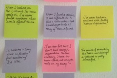
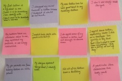
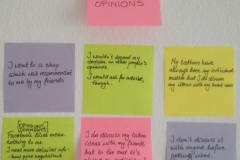
Interview Findings
- the most decisive factor in choosing a tattoo artist is the style they specialize in
- most of them have never heard about any tattoo related apps
- in search for inspiration, they would most likely use either Instagram or Google search
- looking for information on tattoo artists can be overwhelming for newbies, as there is a lot of information out there, and no way to filter it out
- in general, my app would be more helpful to people who have none or a small number of tattoos, as those who already have more experience with this subject get in contact with other artists by word of mouth
User Personas
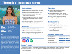
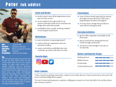
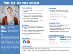
Meet Veronica, Patricia and Peter.
Veronica – indecisive newbie: doesn’t have any tattoos but she’s always wanted to have one. She has couple of ideas but doesn’t feel very strongly about any of them.
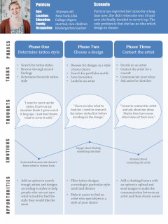
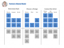
Patricia – one-time tattooee: has only one tattoo on her shoulder blade and she had it done when she was 18. She feels that it doesn’t suit her anymore, and would like to cover it up but she has no idea which design to choose.
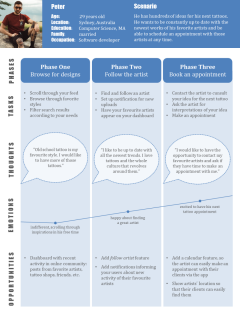
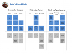
Peter – ink addict: being a regular customer of local tattoo shops for over ten years now, some of his tattooists became his closest friends. He has over twenty tattoos in total and he’s browsing through tons of tattoo designs on his Instagram everyday.
Ideate
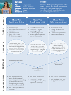
User Journey Maps
Equipped with my research findings, I embarked on a journey together with my personas. I created a visualization of processes each persona has to follow in order to achieve their goals. I included phases which they go through, tasks they need to complete in each phase, possible thoughts and emotions that might be evoked during the use of the product, as well as opportunities and recommendations for me as a designer.
User Mental Models
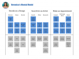
In order to empathize with my users further, I went on to develop mental models. Based on data collected during interviews and surveys, I created mental models for each of my persona. They helped me better understand my users’ motivations and their thought processes.
User Flows
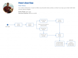
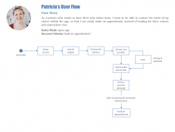
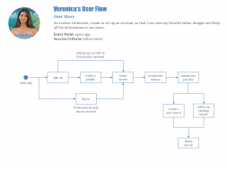
Lastly, I developed user flows for each of my personas. These diagrams represent the steps my users have to follow in order to accomplish their goal. Following thier footsteps helped me discover what kind of features would be the most useful for my target users and which steps would they need to take in order to get from an entry point to success criteria.
Veronica’s goal: save tattoo to favorites
Patricia’s goal: schedule a consult with an artist
Peter’s goal: find artists to follow
Prototype
Sitemap
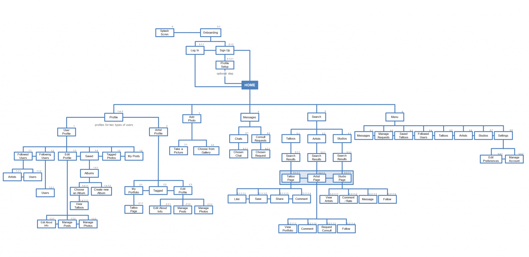
Before jumping into the next step in the design process, I created a sitemap, which illustrates the IA structure of my app. I laid out connections between the pages and established levels of hierarchy. To refine the map I used Card Sorting method, which helped me understand what kind of structure of information would be the most intuitive for my users. I introduced further modifications after user testing.
The final version of InkTank’s Sitemap can be seen below.
First Sketches
After “brainstorming” phase, it was the high time to start my favorite step of the design process: sketching.
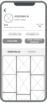
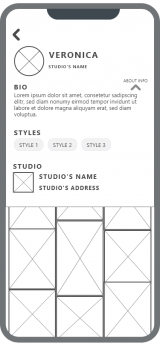
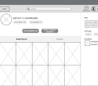
Equipped with pen and paper, I began to sketch out steps of my personas’ user flows. Using rapid prototyping methods I created first wireframes, which then helped me define the structure of the layout and basic interactions.
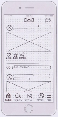
First Newsfeed Versions


Saving Tattoo to Favorites


Requesting Consult with Tattoo Artist


From Low- to Hi-Fi Prototypes
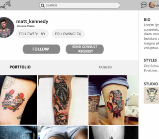
During the whole design process, I used iterative approach, which let me continuously refine my prototype and introduce changes and improvements along the way.
Throughout the process of designing from low-, through mid-, to high-fidelity prototypes, I gained experience with major industry recognized tools, like Balsamiq, InVision and Adobe XD.
User Testing
Usability Test Plan
Having a highly functioning, hi-fi prototype of my app, I went on to conduct user tests. I started with creating a test plan outlining the scope, goals and logistical details of the test.
Goals:
- validate my design decisions
- measure learnability of the app when interacted with for the first time
- observe if users understand the app and are able to complete its core functions
Test Objectives:
- determine if participants understand how to use app
- establish if users are able to request a consult with a tattoo artist
- observe how they navigate through the app and how difficult it is to find relevant information
Methodology:
- moderated tests
- both in-person and remote
- tests include an introduction, task performance and debriefing
Participants:
- 6 personally recruited participants
- participants fit with InkTank’s persona
Test Analysis
Following my script, I counducted six usability tests for both mobile and desktop versions of my app. Afterwards, I analyzed and synthesized all information gathered during the test and created a thorough test report. All major issues spotted during usability tests were taken into consideration and prototypes were revised accordingly.
Issue 1: Viewing consult requests
Severity: high
Evidence:
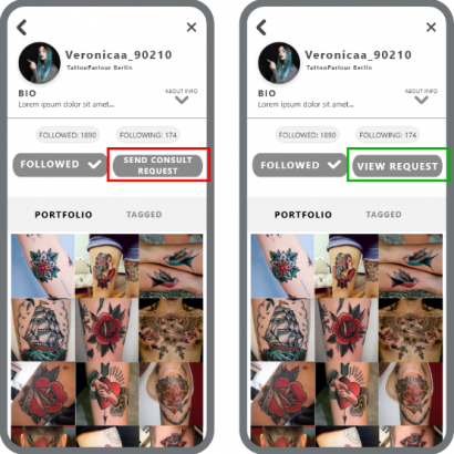
33% of my testers wanted to view their sent requests directly from artist’s profile and were disappointed when they learned it’s not possible.
Actions:
After sending consult request, the user goes directly to the artist’s profile, where the CTA “send consult request” is replaced with “view request.” Clicking on the buton forwards the user to sent consult requests.
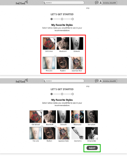
Issue 2: NEXT button placement
Severity: high
Evidence:
One third of my testers didn’t recognize that the first onboarding screen on desktop is scrollable, and thought that their only option at this point is to skip the whole onboarding process.
Actions:
I widened the window showing example pictures of tattoo styles and spreaded it so that there’s no need to scroll the page and the Next buton is immediately visible.
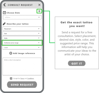
Issue 3: Confusion around sending consult requests
Severity: medium
Evidence:
67% of my users were unsure of the purpose of this feature and were confused by some of the forms to fill in.
Actions:
I introduced a pop up triggered by a question mark icon, which briefly explains the feature. Also, I changed the label from Price range to Preferred price range, as some of my testers asked why would they be the ones to set the price.
Refine
UI Design
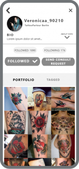
After the usability issues were resolved, I could start developing my app’s UI. As the product is in general very heavy with visuals and gaphics, I decided to go with very simple white and light gray layout with blue-green accents.
To see a more detailed presentation of InkTank UI refinement process, click here.
Polishing the Design
As I have already mentioned above, designing InkTank was an iterative process. I created numerous versions of wireframes, and all the changes I introduced (to both UI and UX of my app) resulted from user testing feedback, reviews from my peers and my growing experience with design tools.
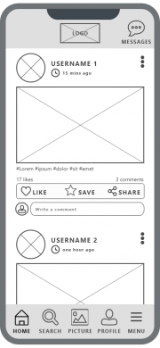
Newsfeed
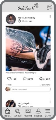
Newsfeed page has undergone several changes throughout the design process. Beside the obvious visual changes, I replaced the icon Picture, because my users were mistaking it for a galery of saved pictures, instead of a take/upload photo feature. I also decided to place the icon Menu in upper left corner as it conveys only additional, secondary features and it wasn’t necessary to have it in the main navigation bar.
Searching for Tattoos
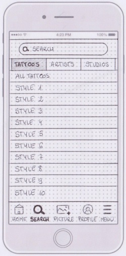
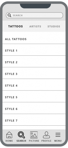
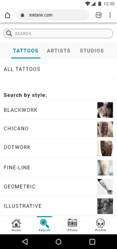
Firstly, I decided to separate the list of tattoo styles from all tattoos, so it would be easier for my users to find what they are looking for. The most significant change to this wireframe was introduced after my peers suggested to add preview pictures next to tattoo names for easier search.
Displaying Search Results
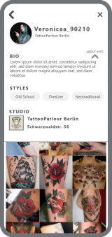
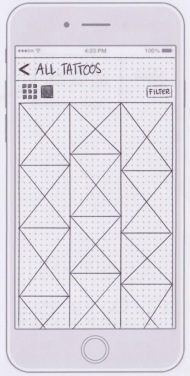
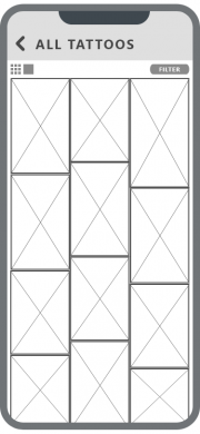
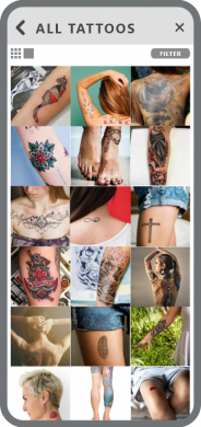
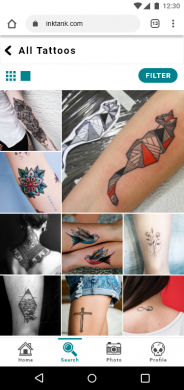
After translating the wireframes from lower to higher fidelity, I realized that the way of displaying tattoos needs to be improved. The view which is visible on the first two wireframes was impractical and looked bad with actual pictures. Firstly, I decided to show the tattoos as rectangles of the same size but then I introduced a mosaic view to make the search results look more interesting for the user. I also deleted the X from the upper right corner, which was prompting the user back to home screen, and added the main navigation bar at the bottom instead to ensure design consistency.
Wrap-Up
Next Steps
In this project, I focused mostly on tattooees’ point of view – I designed a platform where they can look for tattoo inspirations, save their findings and get an appointment with an artist of their choice. The next logical step for InkTank would be to focus on another side of the coin – to design solutions for tattoo artists, who need entirely different features from the app. They would need an easy way to create their portfolios and their online profiles, or help with managing their calendars. To tackle their problems in a right way, I would conduct proper user research, and then usability tests, targeted only at tattoo artists.
Final Thoughts
InkTank project was my first major UX Design challenge. It took over four months to complete and encompassed a full design process – from ideation to realization. Thanks to CareerFoundry course, I gained a lot of useful insights to User-Centered Design methodologies, as well as major industry-recognized tools, and had a chance to put everything that I learned into practice.
Special thanks go to Elvira Hellenpart, who was my CareerFoundry tutor, and Alicja Suska, who mentored me throughout the course – your advice was golden.
Final Prototypes
If you’d like to see the final versions of InkTank, watch the presentation video below or check out my clickable prototypes:

